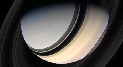
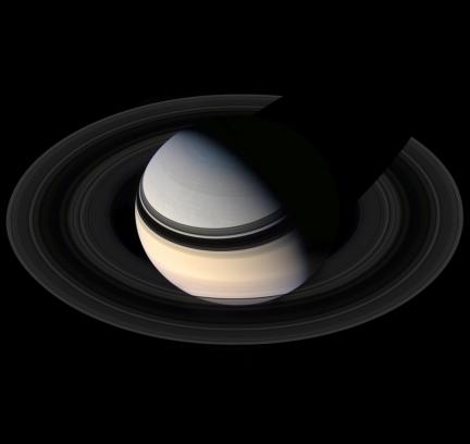
 The one Saturn image that we keep coming back to at wanderingspace seems to be the Ian Regan portrait of Saturn. The composition, angle and color captured in the shot somehow seem to be better than any other. While there are a few other full Saturn images now available from the Cassini mission, none seem to have captured the drama that this one does. The angle that the ring shadows fall on Saturn’s disc, the phase that Saturn happened to be in at the time and the color available as the shot was taken from a more northern position. However, trying to apply the image to larger scale resolutions was not possible as the resolution in the orignal would require that the rings be extended to fill the frame on the left, right, bottom and potentially the top as well (I was also curious to see if the image was just as impressive if it was not angled and cropped as it is in the original). Extending the rings in one direction is easy enough, but doing it on all sides is near impossible to try to do in any image editing software such as Photoshop.

Instead, a one pixel wide swash of the rings was sampled and turned into vectors using Adobe Illustrator. This further allows Illustrator to stretch and curve the ring information captured without having to worry about resolution or pixel distortion. The row of rings was then applied to a brush pattern and applied and wrapped to a simple circle shape. Now the rings are in full circle and the proportions are adjusted. That full set of rings was then rendered in 3-D software and the correct angle as well as perspective was applied and matched with the original Ian Regan image underneath the render for reference.
After that, all that is left to do is merge the Regan image to the rings (and maintain as much of the original image as possible) and artificially add the disc shadow that would fall upon the rings behind the planet iteself.
To see the image in hi-res use check out the 2560x1600 wallpaper sets for The Planets and Saturn Scenes
